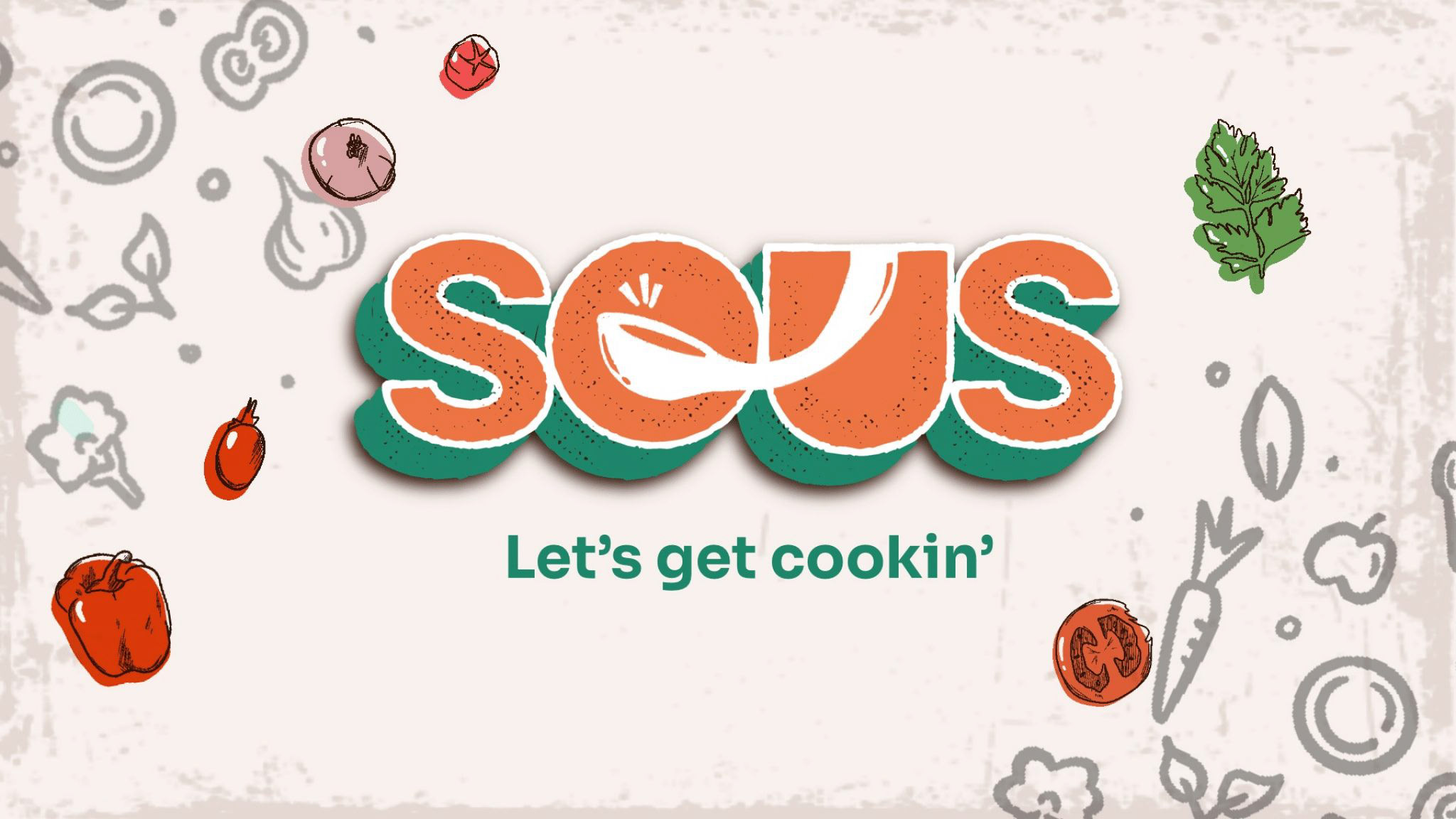
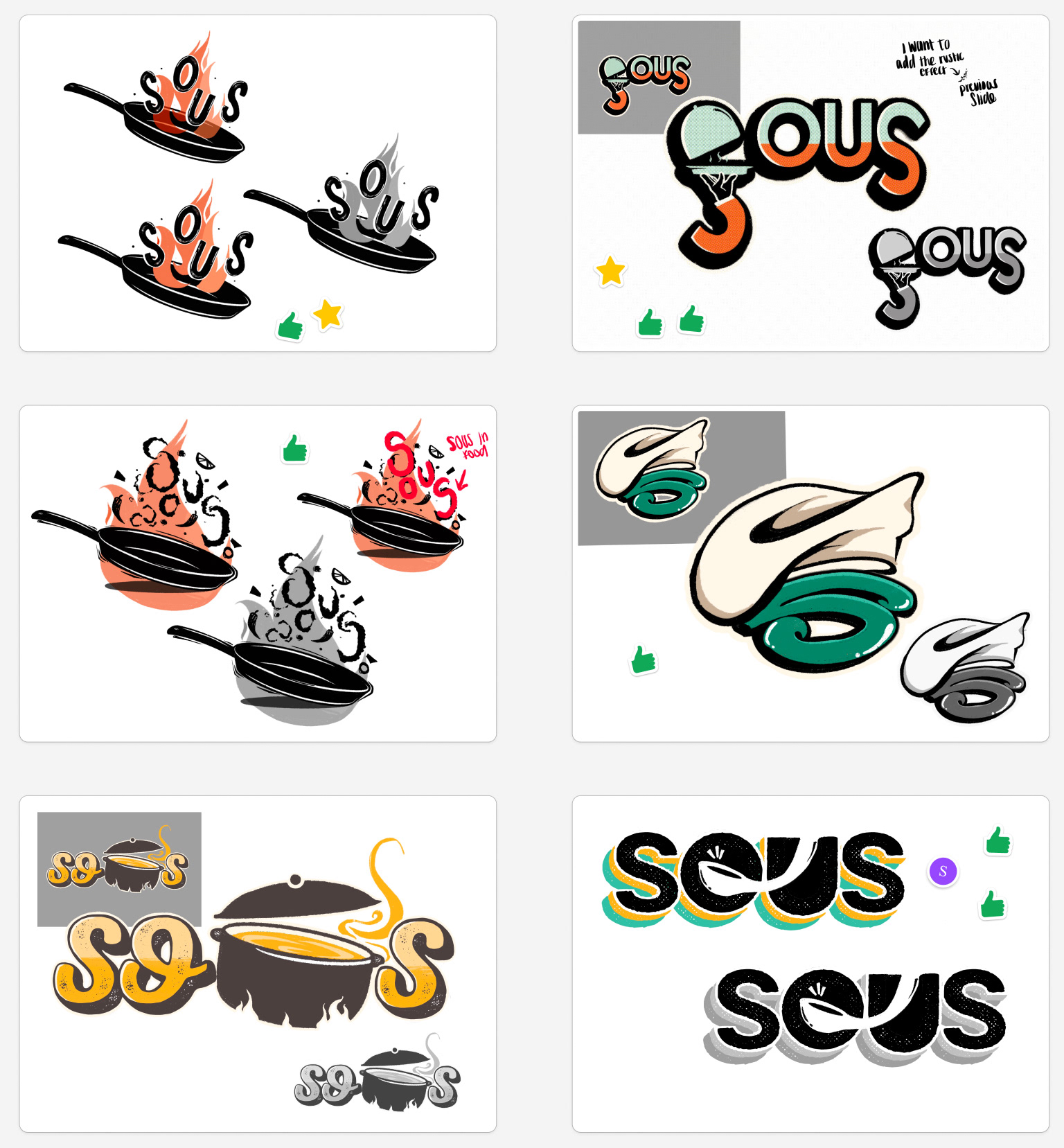
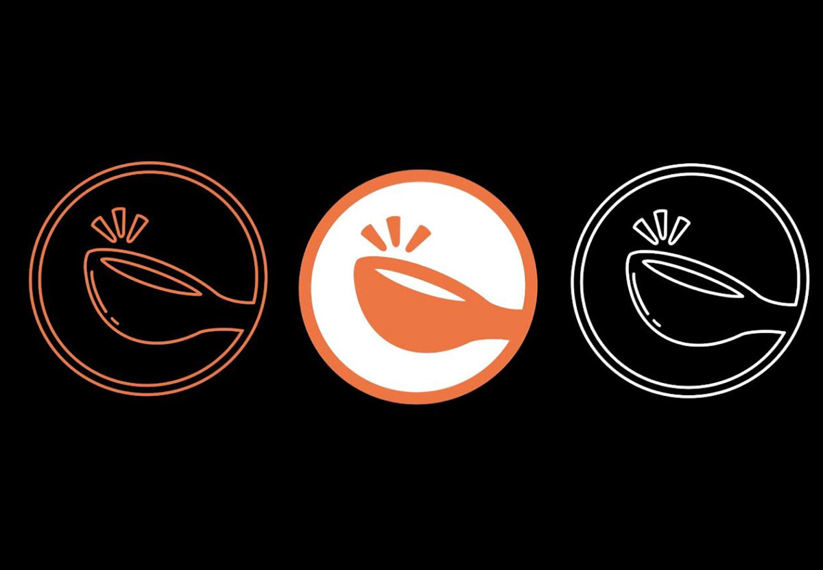
Creating the logo for the brand was not a simple task. Not only did the logo have to be easily recognizable and responsive, but it also had to get the idea of our brand across. Here are some iterations I came up with! We eventually settled for the spoon design! It was simple and it got our brand across!


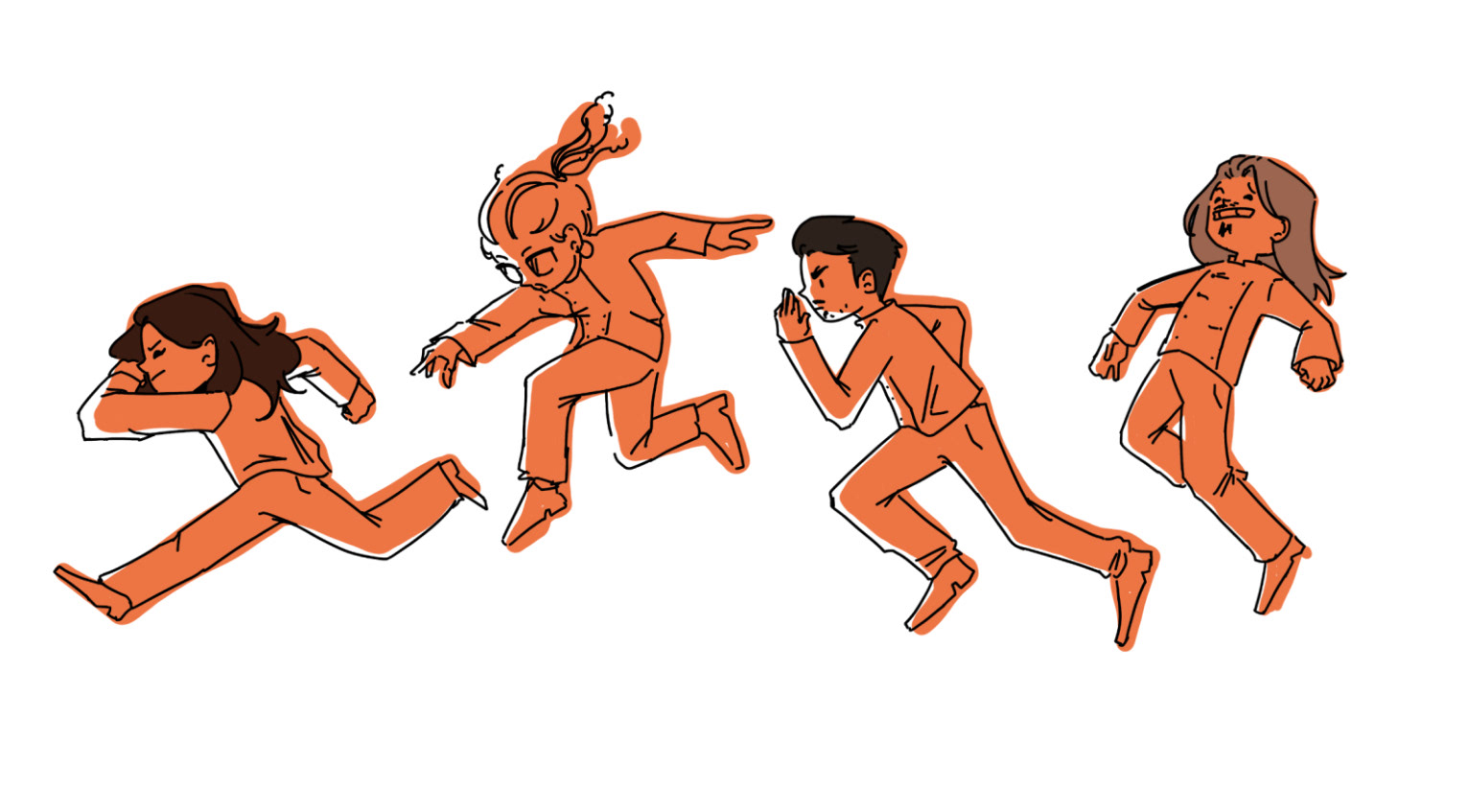
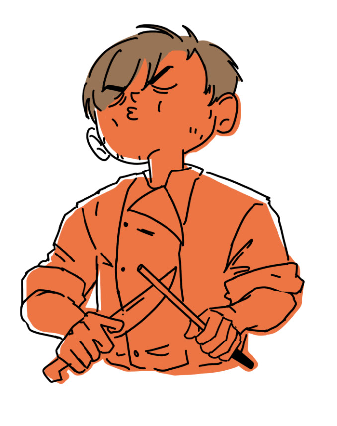
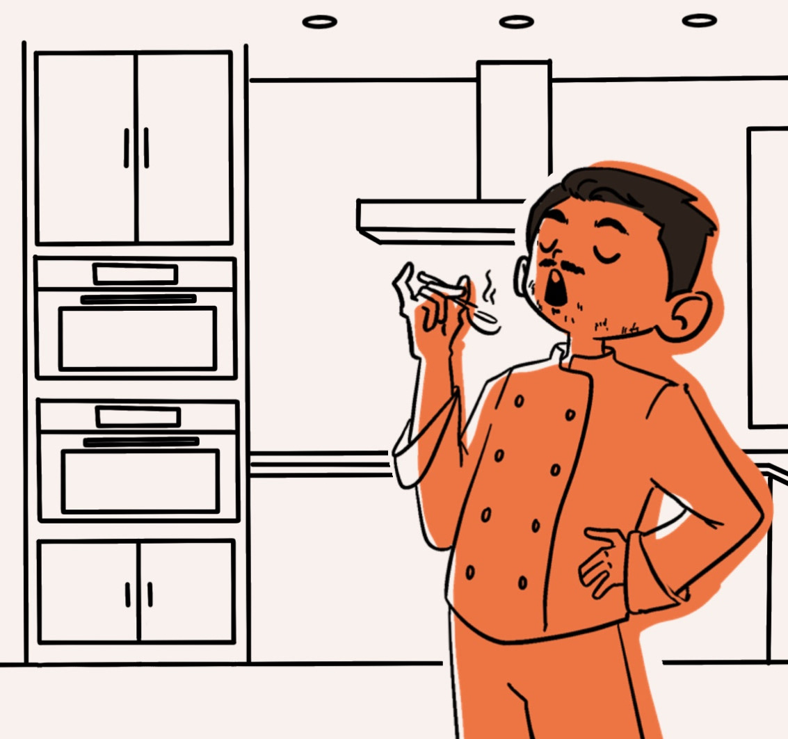
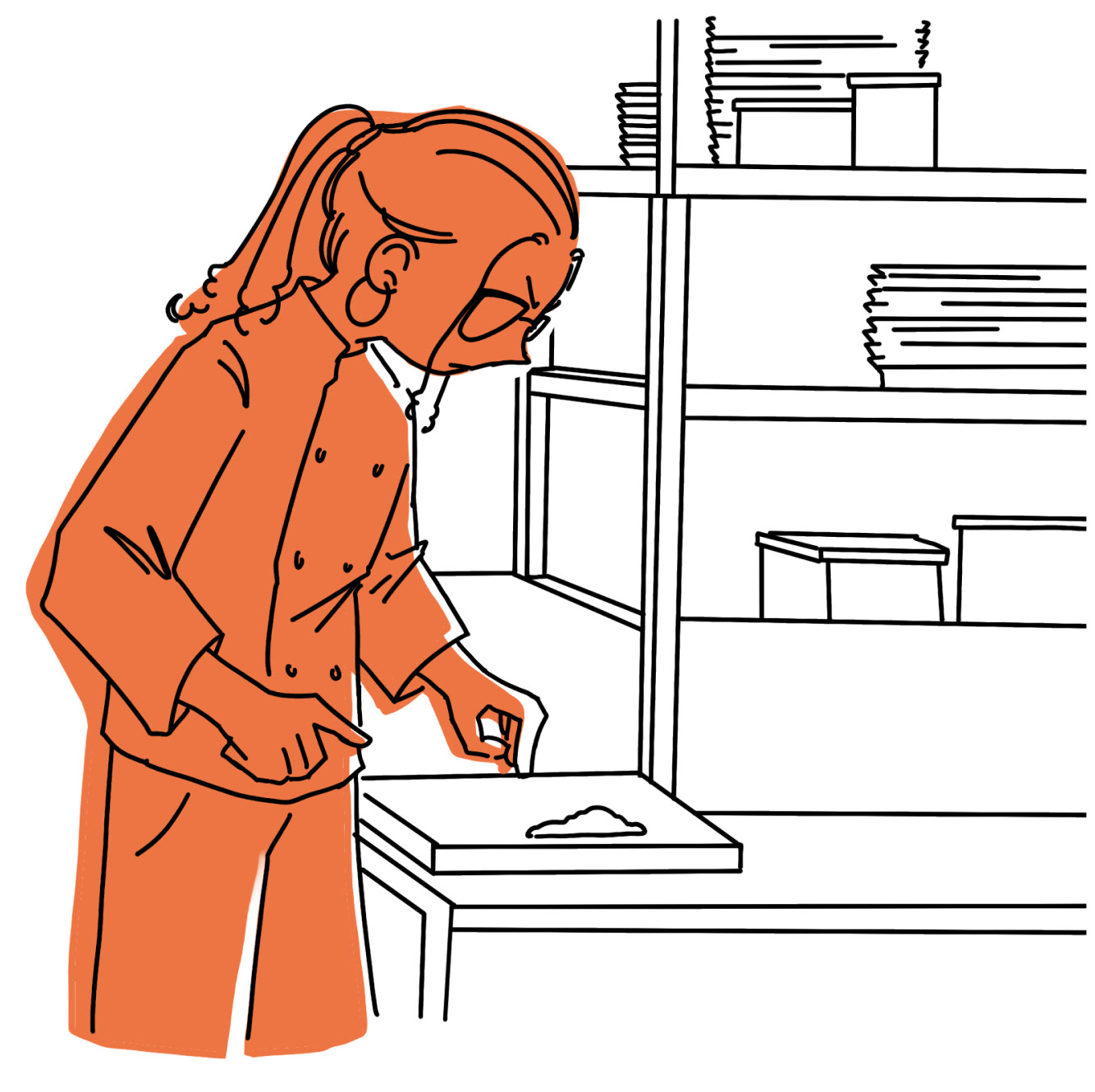
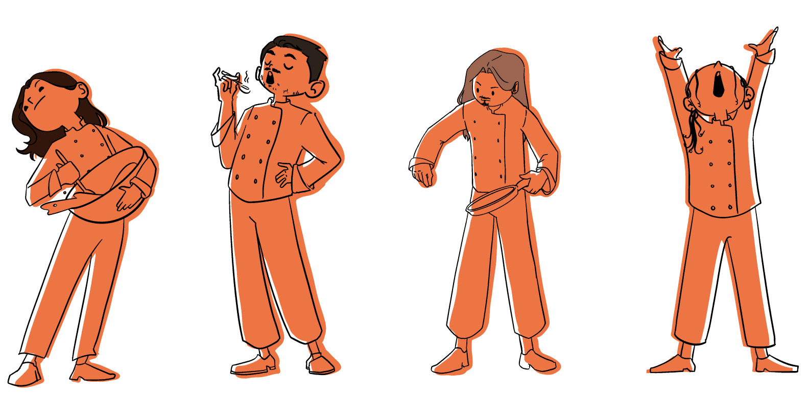
Our team decided to focus more on a graphic aspect rather than a realism aspect for the design of the brand. We felt as if the graphic element catered to the target demographic and seemed more "Tween-like." The characters in this piece are actually my team members! I thought it would be cute to make them as little chef avatars for our brand, highlighting the connection between us and our product.
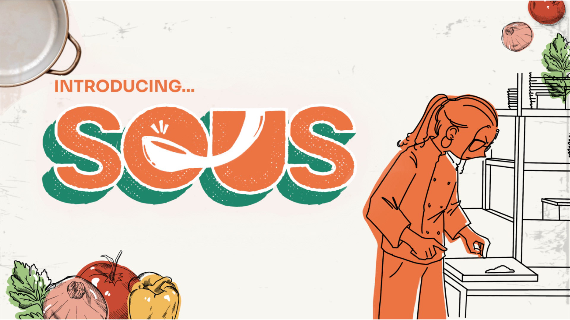

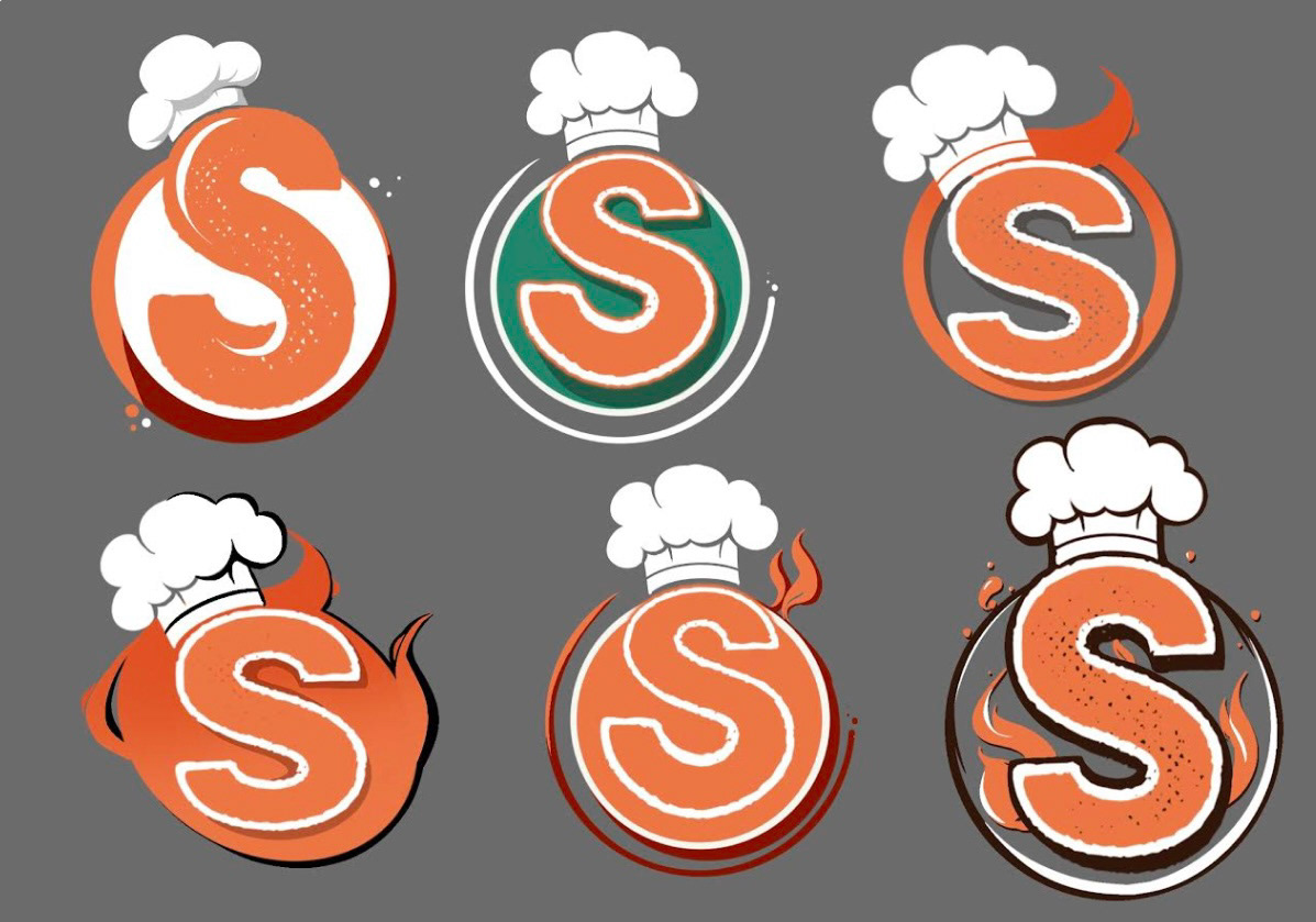
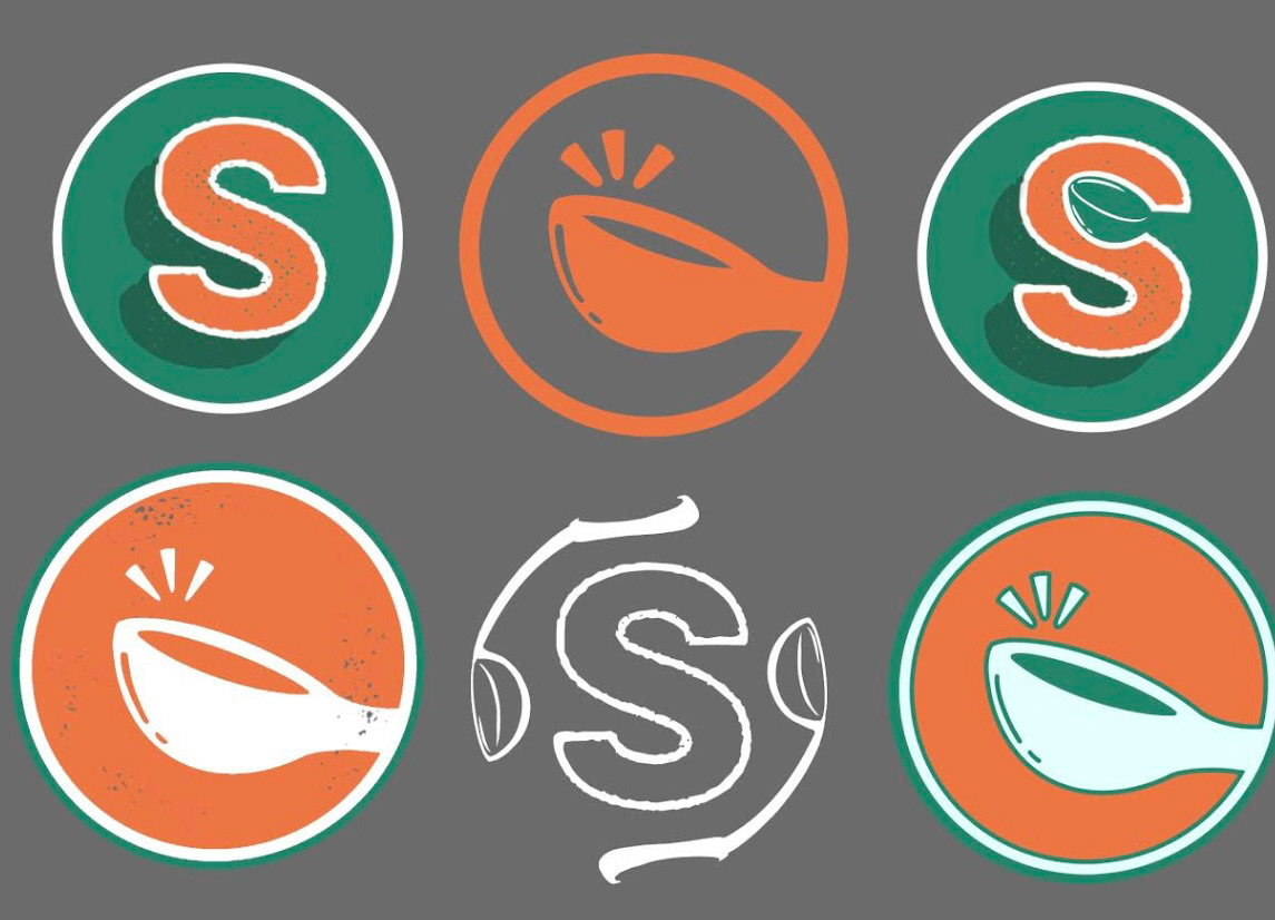
I wanted the colors to be vibrant to represent youth and energy. here are some iterations of the logo so that we could try getting that across. At first, I struggled with choosing a primary color, but I eventually settled on orange since that also represents hunger and food!

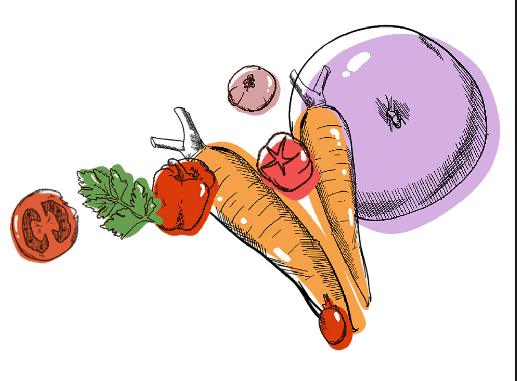
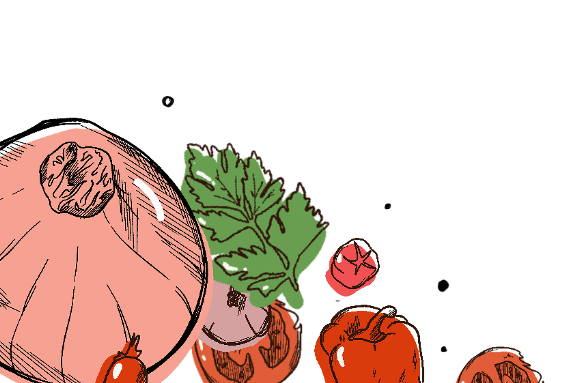
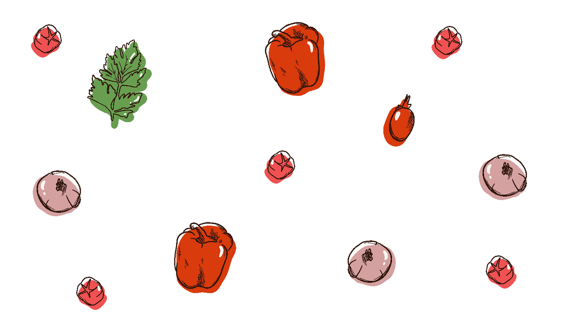
Because this product was a kitchen appliance that would help with gaining independence through cooking, we obviously needed food! Here are some of the foods that I designed. I wanted to keep my focus on graphic, low fidelity foods, as simple drawings seemed to fit more with our brand!


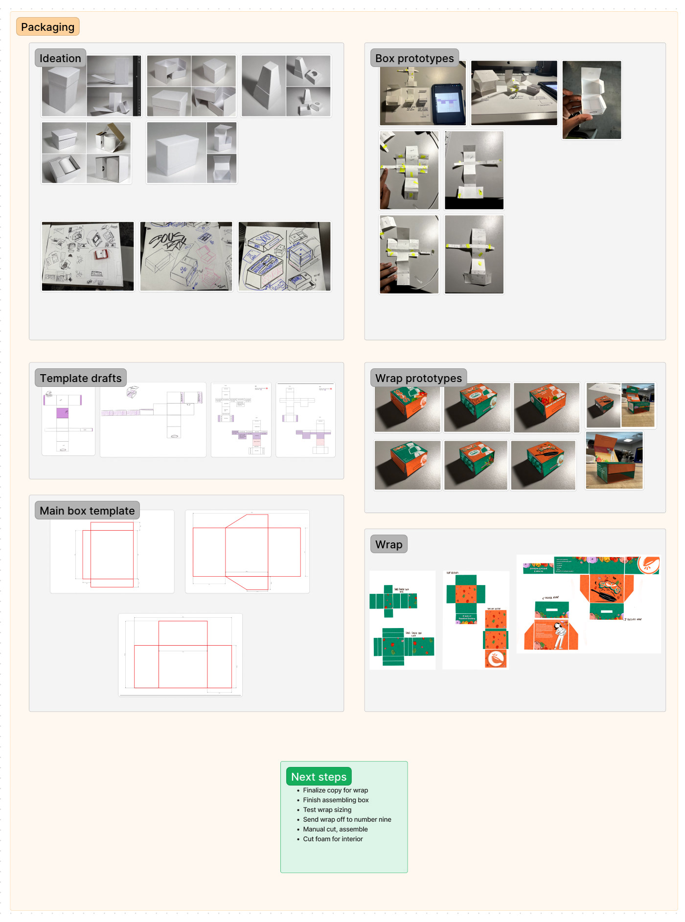
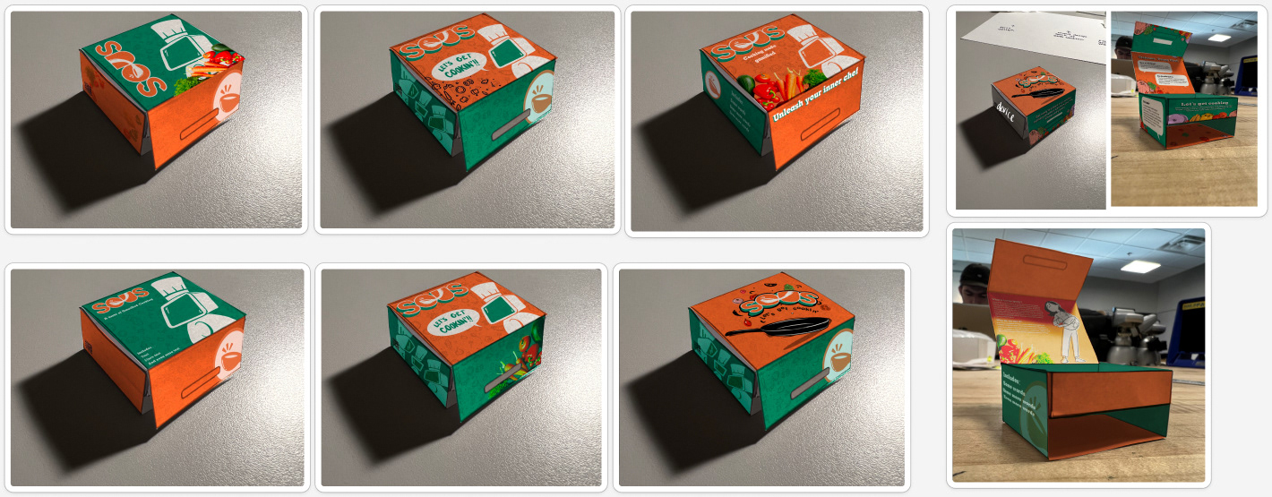
The images above played a great part in designing the packaging for the product as well. Here are some iterations of packaging design, as well as what the final product looked like. I made the box, as well as the wrapping that went over it.


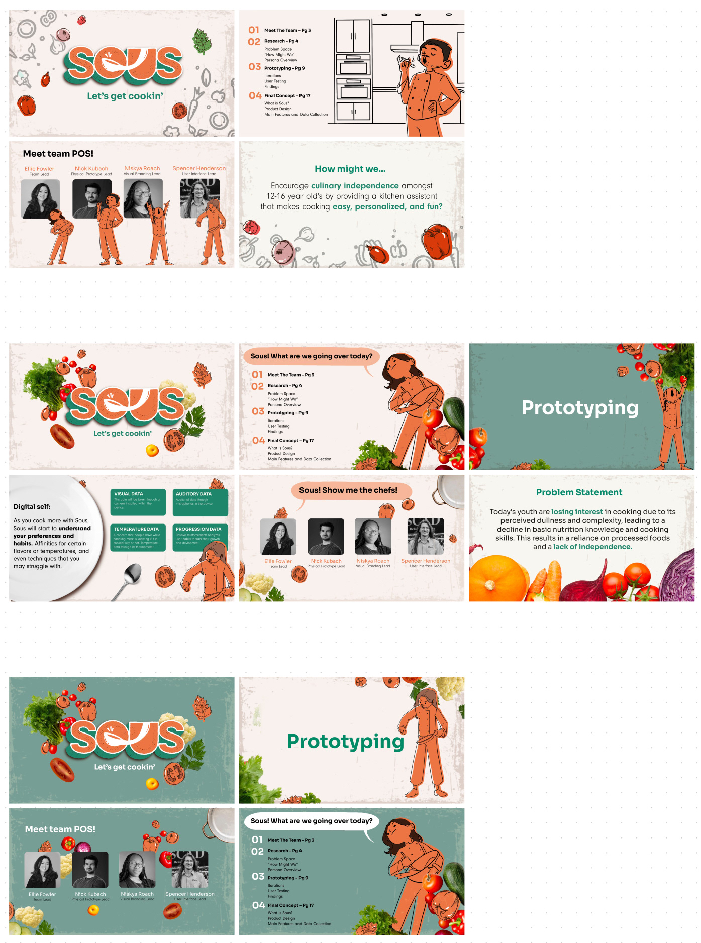
And here is what the final slide deck looks like!